Moonkind cover!
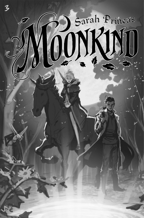
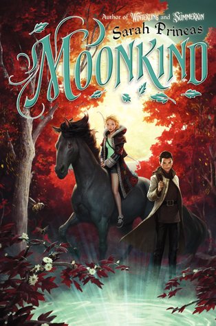
Here it is, Moonkind, the third book in the Winterling trilogy, and you finally get a look at Rook on the cover!
First the rough draft–the black & white sketch:

And the final version, in color:

Tell me what you think! One lucky commenter here will win an ARC of the book!!
Moonkind comes out on January 1st 2014.
Posted in Contests, Winterling on 07/16/2013 01:52 pm

07/16/2013 at 2:07 pm
LOVE the cover! Can’t wait to read and share!
07/16/2013 at 2:11 pm
Glad you like it!!
07/16/2013 at 2:19 pm
Gorgeous art! Is it hard to imagine what the artist will do for a cover? What’s it like as an author to wait to see what they’ll come up with? Looking forward to the book.
07/16/2013 at 2:24 pm
Thanks, Cindy!
Sometimes I have an image in my mind of what the cover *might* look like, but it’s always wrong. Then it’s exciting to see what the illustrator and the art director come up with. They’re so good at their jobs that it always surpasses my expectations.
07/16/2013 at 2:42 pm
The color palettes that you (or your designer, or whomever) choose for your covers make me feel all tingly and good inside. A+
p.s. I’m really commenting because I want a free ARC. Call me a Bookie Monster, if you will.
07/16/2013 at 2:43 pm
🙂
All the colors and art stuff is done by the designer–I don’t have any input on it. Which is FINE because I am a word person and not a graphics person.
07/16/2013 at 2:49 pm
Sarah, it looks amazing and magical! I’m so excited for you, and more importantly, for your readers (including me and my many little cousins who get signed copies of your books!).
07/16/2013 at 2:51 pm
Thanks, Lauren!!
So this morning I was driving Theo to camp and positively STARED at this woman in an oncoming car because I thought it was you.
07/16/2013 at 2:53 pm
The cover looks amazing!!! I have always loved to art on the covers of the series. Before and after I read the book, I just stare at the covers. They have so much detail!!! And I love this cover! Rook looks a little different than I thought, but he was obviously going to. I love this series so much and I have January 1st marked on all of my calendars!!! I can’t wait for the third book!!!! <3 🙂
07/16/2013 at 3:16 pm
Hi Emma!!
I’m glad you like the cover. What did you imagine Rook looking like–how was he different than this picture? I’m curious!
07/16/2013 at 3:12 pm
I like the look of the sketch, but I simply adore the colors they chose. It is very autumnal and that’s my favorite season. Also it has Rook, so it’s my fav of all three covers. 🙂
07/16/2013 at 3:16 pm
I like it the best too, Brandy, partly because of Rook, but I like Fer looking all pensive. She makes a huge mistake at the end of Summerkin and has to deal with the aftermath in this book…
07/16/2013 at 3:16 pm
Love it! My daughter is in love with Fer’s coat! Son will be thrilled to see another book in this uni!
07/16/2013 at 3:18 pm
Yay!! The patchwork coat was fun–and a writer-friend was the one who told me to make it more important in the books. I’m so happy it appears on all three covers.
07/16/2013 at 3:22 pm
That is SPECTACULAR! The original draft has a very anime feel that translated well to the full color version, while still going “painterly” rather than “cartoony.”
07/16/2013 at 3:34 pm
Yes, “painterly” is a great distinction; I know what you mean by the sort-of cartoony look you see with some MG covers. I wonder if it’s a distinction made at the art director level between 8-12 MG and 10+ upper MG…?
07/16/2013 at 5:10 pm
Wow! It looks really nice. I like the blue moon theme! (The magic whirlpool)
07/16/2013 at 6:29 pm
Well, the magic whirlpool is the Way, of course!
07/16/2013 at 5:24 pm
That totally pops. It’s interesting how, of all three books, this one has Fer in the least action-y pose, yet the colors and composition make it dynamic. And Rook is hawt.
07/16/2013 at 6:30 pm
Heh.
Yeah, I was happy that she was actiony in the first two, as a lot of the artist’s other covers have girls in static poses (Merrie’s frex). This one works, though.
07/16/2013 at 5:51 pm
Very classy looking cover there, Sarah!
07/16/2013 at 6:30 pm
Thank you!
07/16/2013 at 6:11 pm
I really love it! Whoever is your illustrator is amazing. I would love to be an apprentice! (Haha, kidding, but they certainly are amazing!) I cannot WAIT to read it, but I am halfway through SUMMERKIN (Oh life, how you hate me so) and you’ll be the first to know what I think!
07/16/2013 at 6:31 pm
Thanks! The artist is Jason Chan–I should have posted a link!
07/16/2013 at 6:50 pm
It’s the bee’s knees — autumn AND bees!! As others have said, it’s my favorite of the three. By the way, I love the way the titles have become ever more inclusive through their suffixes, from -ling to -kin to -kind. It’s nice that Fer is finding her folk! [Is it just me — I feel Little Fur Family lurking in the background, like if you parted those tree branches on the cover, you’d find that teeny-tiny little furry critter running through the grass… Remember him???] — When will it be out?
07/16/2013 at 6:59 pm
I think Fur Family was Margaret Wise Brown, wasn’t it? She was a HarperCollins author, as happens, and my editor has her editor’s desk in her office. It’s like a book genealogy! 😀
07/16/2013 at 6:59 pm
Oh! And it’s out on January 1st 2014. Six months-ish.
07/16/2013 at 7:22 pm
I love the color scheme and how the new cover will assimilate the previous two book covers. Breathtaking!
07/16/2013 at 7:30 pm
Thanks! So glad you like it. And I’m realizing how many elements tie the three covers together.
07/16/2013 at 7:53 pm
Ah, this is gorgeous. The colours make the cover so vibrant. I especially love the leaves around the title.
07/16/2013 at 9:03 pm
Thank you! And that is *exactly* what I said to my agent when I saw the rough draft: love the leaves. She was like, “huh, I didn’t even notice them.” D’oh!
07/16/2013 at 10:12 pm
The colors look like it’s jumping right out at you! It’s beautiful. I think I’ll need to take a chill pill!!
07/16/2013 at 10:14 pm
Thanks! Sounds like the colors are really working for people!
07/17/2013 at 2:06 am
This my favorite one yet! I actually like it better without color
07/17/2013 at 2:15 am
The sketch, you mean? I was just saying to a friend that the sketch version of Rook looks more like him than the final cover does. 🙂
07/17/2013 at 8:53 am
This just made me a happy pickle. I love this fall theme it’s so beautiful. The only thing I like better in the sketch is their hair and facial expressions. Also that’s the second time I saw you make mention of a mistake Fer made in Summerkin, it’s making me feel a little brain dead. Is it something obvious that I’m overlooking?
07/17/2013 at 11:34 am
Always glad to make a pickle happy! 😀
So Fer’s mistake. I guess the mistake doesn’t really become evident until the third book.
At the end of Summerkin there are the Lords and Ladies who attacked her land with Arenthiel–having defeated them, Fer demands that they swear an oath to give up their glamories. In Moonkind Fer realizes that they cannot fulfill this oath, and so very bad things start to happen, and it’s all her fault.
07/17/2013 at 5:53 pm
Glorious cover! I really like Fer’s expression on this one. She has matured in so many ways since her first adventures in Winterling. Great character arc! And Moonkind’s cover beautifully captures and expands the themes of the covers in Winterling and Summerkin. Is there such a thing as a “cover arc,” I wonder. If so, this is a great example! Terrific series, Sarah. I’m looking forward to January.
07/17/2013 at 6:02 pm
Thanks, Jane! I never really thought about “cover arc” before, but it’s got to be a thing…!
07/18/2013 at 6:57 pm
I really love the trend in covers that look like they’ve been digitally painted, almost like animation but more vibrant than cartoon and more artistic than CG. I think covers and titles sell the book a lot of the time, because the saying “Don’t judge a book by it’s cover” is really just a metaphor. Whenever I go into a bookstore I always look for the books with captivating covers and unique typefaces (with intriguing titles, plus authors I know). Ok, that sounds way more complicated than it is, but the whole thought process is a lot shorter 🙂
I’m really excited about this one (especially because Autumn is my favorite season and we’ve already covered winter, spring, and summer)! I think I agree that Rook looks a bit different than how I imagined him; I saw him as a bit less put together. Still really amazing to have him on the cover though, especially since Phouka has been on the last two 🙂
07/18/2013 at 7:57 pm
Hi Tasha! Thanks for the comment.
I was SO glad they decided to put Rook on the cover too, since he’s such a big part of the story. Now, regarding Rook looking more “put together” than you expected…
He cleans up a bit in this one! It’s sort-of a running joke, but he’s back to his scruffier self pretty quickly. 😀
07/22/2013 at 10:12 pm
So THAT’S it. I love the cover-it’s beautiful- but the first thing I thought when I as it was “that’s the artist’s idea of scruffy hair?” 😀 ha ha. I’m really looking forward to Moonkind.
07/22/2013 at 7:03 am
I like the Moon Trifecta- the actual moon (which I thought was just a super sunny-filled, cloudy autumn sky; until BOOM! Messin’ with your mind- actually just a giant harvest moon of GLORY. And magic. Yeaaah. Pretty cool.) Then the classic crescent moon symbol- a nice touch that nestles the author’s name into the sky, which is also the fabulous dusk green of dusk (check it out in sunsets- fabulous!). And below that is the totally abstracted variation of the moon that is the word ‘moon’ (having many swashing curls and calligraphic strokes- also magic) which makes up the title of the book (a fairly important detail to have on a cover).
All moons overlaid at the top, then first is reflected at the bottom, in radiant portal-like splendor. Fantastic!
Sweet cover, j’adore!
07/22/2013 at 12:44 pm
Love it! HARVEST MOON OF GLORY is what I’m calling it from now on.
And you’re the lucky winner of the MOONKIND ARC. If you’ll email me your address, I’ll send along the copy. Cheers!
thiefofmagic@gmail.com
07/29/2013 at 2:02 am
Sweet! 🙂